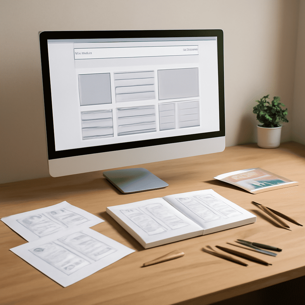
Creating an effective online presence involves understanding the basics of webpage design. The foundation of constructing these digital platforms lies in mastering core design elements and layout techniques. Here’s a guide to help you get started on this creative journey.
Understanding Design Elements
Design elements form the building blocks of any website. It's crucial to recognize their importance and learn how to use them effectively.
1. Color
Color plays a critical role in setting the mood and conveying the brand's personality. A cohesive color scheme can enhance user experience by providing visual harmony. It's advisable to consider color psychology to evoke specific emotions or reactions from your audience.
2. Typography
The choice of typography significantly affects readability and the overall aesthetic feel of a webpage. It’s essential to select fonts that reflect the style of the content while ensuring text is legible. Balancing different font sizes and styles, like headings and body text, can guide the reader's eye and establish a visual hierarchy.
3. Imagery
Images contribute to storytelling and help convey messages quickly. High-quality images that are relevant and optimized for the web can drastically improve the visual appeal. It’s also important to maintain a consistent style across all images to preserve the site's visual integrity.
4. Space
Often underestimated, space, or whitespace, impacts how content is perceived. Adequate use of whitespace improves readability and makes the layout feel less cluttered, allowing the user's attention to focus on key areas.
Mastering Layout Techniques
The layout of a webpage affects how content is organized and perceived by users. Here are key techniques to consider:
1. Grid System
Using a grid system helps in aligning elements consistently and creates a structured and balanced look. Grids guide the layout visually, making it possible to predict the placement of elements, which enhances the user experience.
2. Responsive Design
With the proliferation of various devices, it's imperative to ensure that your site looks great on any screen. Responsive design involves creating layouts that adapt smoothly to different screen sizes, ensuring that users get the best experience, whether on a phone, tablet, or desktop computer.
3. Navigation
Effective navigation makes it easy for users to find the information they need. Clear and intuitive navigation should be prioritized, considering a design that takes users on a logical journey through your content. This involves simplifying menus and ensuring that links to important sections are visible and accessible.
4. Focal Points
Creating focal points on a webpage draws users' attention to specific areas. This can be achieved through the placement of elements like calls to action, visual accents, or informative banners. Using contrast and size creatively can help emphasize these focal points effectively.
Conclusion
Constructing a website involves a blend of art and science. Employing design principles and mastering layout techniques are crucial first steps in creating platforms that are not only visually appealing but also functional and user-friendly. Remember that the goal is to create a seamless experience for visitors, guiding them compellingly through your content while maintaining visual harmony. With dedication and practice, the craft of constructing effective digital spaces becomes an enriching and rewarding endeavor.