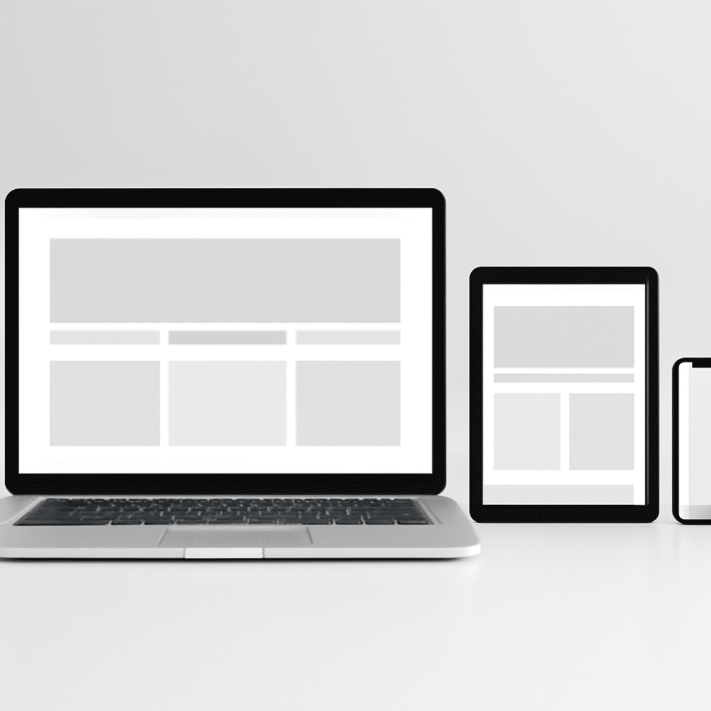
In the contemporary world of the internet, where users access information and services from various devices, creating adaptable digital experiences has become essential. This is where the concept of adaptable design emerges. Its primary goal is to provide an optimal viewing experience across a wide array of devices, from smartphones to desktop monitors.
The cornerstone of this design philosophy is flexibility. By constructing layouts that fluidly adjust and rearrange based on screen size, designers can ensure that content remains accessible and visually engaging, regardless of the device. This is achieved through a combination of flexible grids, fluid images, and media queries.
Flexible grids use a percentage-based approach, allowing elements to resize dynamically. This replaces the rigid pixel-based grid system and offers a smoother experience as the user transitions between devices of different sizes. For example, a three-column layout on a large screen can effortlessly morph into a single-column layout on a smaller screen.
Fluid images play a crucial role as well. By allowing images to scale within the confines of their parent element, the risk of images overflowing or distorting is mitigated. This ensures that visuals remain sharp and appropriately sized, contributing to the overall aesthetically pleasing experience.
Media queries, a fundamental part of CSS, empower designers to apply specific styles targeted at certain device characteristics. Whether adjusting font sizes for readability on smaller displays or modifying navigation structures for touch interfaces, media queries offer the precision needed to tailor the experience to the user’s device.
Beyond technical implementation, it's important to consider user experience and accessibility at every stage. Navigation should be intuitive, ensuring users can seamlessly find information without frustration. Touch-friendly elements, clear typography, and high contrast ratios are vital for making interfaces accessible to all users, including those with visual impairments.
Testing is a critical phase that should not be overlooked. With such diverse device specifications, rigorous testing ensures that the experience remains uniform across multiple platforms. Leveraging browser developer tools can be immensely helpful in simulating different environments during development.
Ultimately, adaptable design is not just about technology; it's about understanding how users interact with digital content across a spectrum of experiences. Prioritizing user experience leads to increased satisfaction, engagement, and retention, which are indispensable in today’s digital landscape. Embracing this philosophy is not just a trend but a necessity in creating future-proof digital experiences.